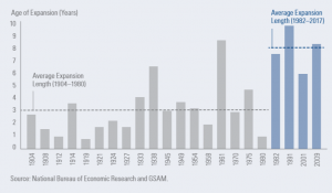
There were a couple of great slides in their slide deck that I thought were worth sharing. The first chart has to do with the length of this bull market cycle. Just because this bull has been running since 2009 doesn't mean that it will suddenly end because of old age. In fact, as you can see in the chart below, the cycles since 1980 have become longer, as central banks more aggressively targeted inflation and policies improved financial stability. In the past, bear markets would typically emerge every 3-4 years but since 1980, it is more like every 8 years.

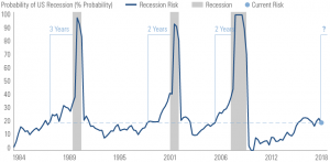
The next chart is Goldman's recession probability indicator. In January, they are showing just 20% risk of recession. Looking back, when the risk is at this level, recession doesn't occur for another 2-3 years! This is good news. We concur with this view because we see strong economic data that isn't showing signs weakening. The bad news is that if you look at the 1987 crash, this recession indicator would be no use. This is why you can never use just a one-factor model. Black Monday was triggered by rapidly rising interest rates and that is why rates are the key factor for 2018. As long as we don't get a spike in long-term rates, we believe that the bull market will continue marching along. However, if the Fed's balance sheet unwind or strong inflation causes rates to rise 100-200 basis points, stocks would likely see a meaningful correction.

“Bull Market Sign” by ota_photos is licensed under CC BY-SA 2.0


